Phone Home! Wiggle Mode Gets An Upgrade
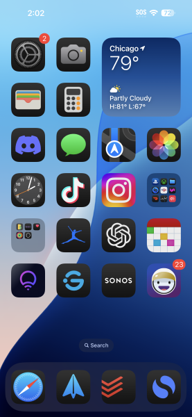
iOS 18 is focused on your Home screen, though for those that care they are far more interested in the addition of Apple Intelligence; to defend its implementation or to mock the problems it has. Instead of trying to play a bizarre sliding puzzle with wiggling icons on the Home screen, where sliding an icon has an effect on every other icon you now have the freedom to place one anywhere. You can even have an icon all alone on a line with a simple drag. You can make weird shapes with them or just about any pattern, as long as it conforms to the grid.
If the freedom to move icons around worries you, then you probably don’t want to know you can resize the icons as well! Oddly it’s a toggle that makes all your icons the size you pick, but it is a step forward. The lock screen also gets tweaks, if you don’t want the flashlight app at the bottom you can remove it and replace it with something else. You can’t pick just any app, the lock screen only supports some apps but it it still better than it was.
For a deep dive into the changes you should avail yourself of Ars Technica’s review.


